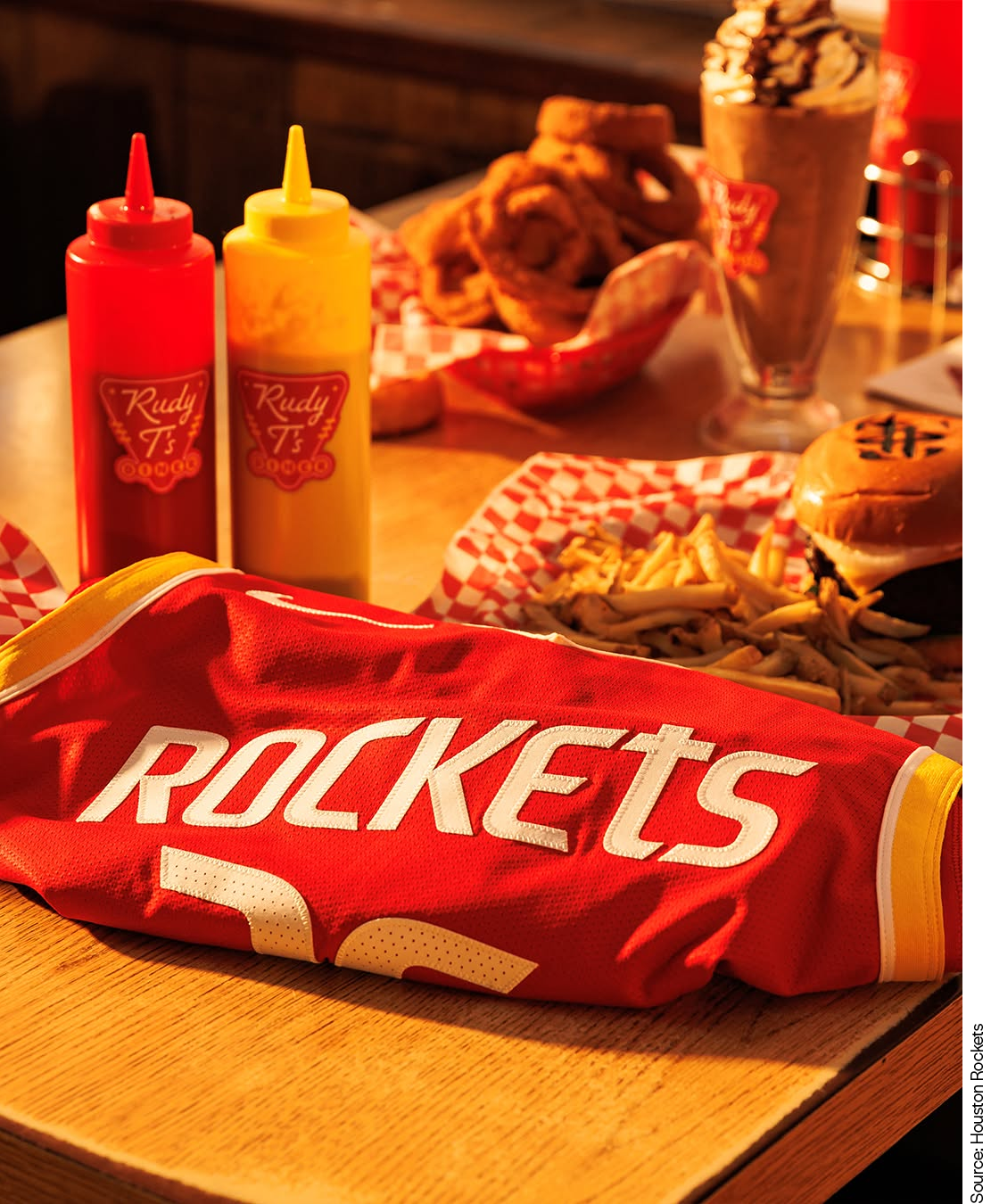
I’ve never seen a brand go this hard on condiment and diner puns. The Houston Rockets’ hot, fresh rebrand has one dominant soundbite: “Ketchup and mustard are back on the menu.”
The thing is, everyone repeating it sounds thrilled. The sense of play is palpable. The Rockets are bounding moonboots-first onto the retro train, which runs on one of marketing’s most potent fuels: nostalgia.
The redesign is built around the return of the classic red and gold palette, used specifically to harken back to the glory days of the ‘80s and ‘90s. The launching “R” logomark gets gilded with a crisp yellow edge. Gold appears as a supporting accent across the entire identity. The Icon and Association uniforms reintroduce tonal pinstripes, a quieter throwback detail that gives longtime fans an “I see what you did there” moment. The fan-favorite Dunkstronaut gets a facelift. The wordmark gets a more futuristic edge, while the lowercase “t” returns in “Houston” and “Rockets” as a specific homage to the team’s past.

I think the kids are calling it “Newstalgia.”
The redesign’s mission seems to be connect multigenerational fans through familiar colors, symbols, and design cues, then use that familiarity to evoke the Rockets’ glory years without getting stuck there. There is a little magical thinking baked in: put on the colors, summon the championships. We were winners then, and we are winners still. Onwards and upwards.
As previous iterations of the Rockets brand have proven, there is more to lose when focusing too much on appealing to the kids. Parents, older siblings, neighbors, day-one fans—these are the people who shape us as we grow. When they invite us into their worlds, we become torch-carriers too.
Emotional loyalty has a better ROI than novelty.
Nostalgia is a handy shortcut to evoking trust and comfort. But in this era of simulated sentiment, people have become rightfully wary of it. Lazy nostalgia romanticizes the past, encourages cynicism of the future, and ultimately stymies connection. But when nostalgia is grounded in lived experience, thoughtfully remixed instead of simply rerun, it can spark flames of incredible optimism.
Not every element of the rebrand is equally successful. The R mark remains a tension point, and its prominent place in the refreshed system has reignited fans’ polarized feelings. While the red and gold feel like a welcome return, the R is a reminder that not every piece of a brand’s history carries the same affection.
Are the Rockets dusting off an old palette because “retro is so hot right now”?
We don’t think so. It feels like an organization fully committing to the bit, and the bit works because it is rooted in the history it shares with the fans who love it. The diner language, the ketchup-and-mustard jokes, the gold accents, the pinstripe callbacks, the revived space mythology: all of it is delivered with equal parts good humor and conviction.
When nostalgia is attached to real memory, it reminds people that they are part of a longer story. That seems to be the Rockets’ deeper strategy. The rebrand validates the fans who never stopped loving the red and gold, the fans who carried the championship years forward, and the fans who passed that language down to their kids before the brand officially returned to it.
The rebrand is aiming for the best nostalgia can be, and we’re excited to see it take off.